Keine Verbindung: a website for a media art exhibition
As part of the student web team, I designed the home page and the Artists & Artworks page for our media art exhibition, then built both in WordPress with Elementor.
2026

- Artists & Artworks
- Exhibition
- Program & Visit
- Young Talent Award
- Zwischen Tanz und Tabu
International Media Cultural Work
Sommersemeter 2026
KeineVerbindung
Medienkünstlerische Experimente
für ein neues Miteinander
Mediaartistic experiments
for new forms of community
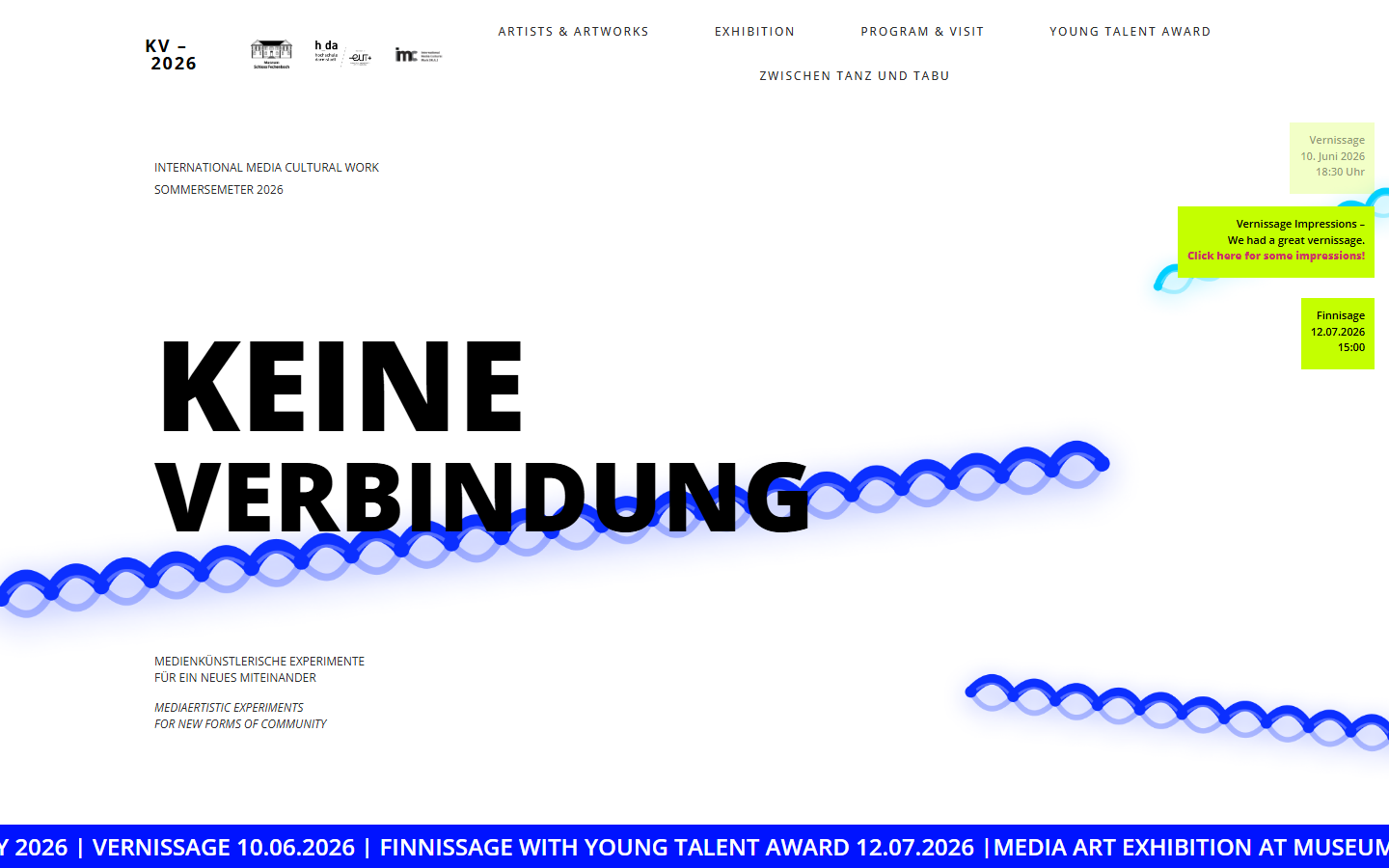
This was a student team project at Hochschule Darmstadt. I designed and built two of its pages.
An exhibition about losing connection
"Keine Verbindung" (German for "no connection") is a media art exhibition organized by students of the M.A. International Media Cultural Work at Hochschule Darmstadt. The works explore digital isolation, fragmented communication, invisible systems and the relationship between people and machines, through video installations, interactive media and sound art.
The exhibition needed a website that announces the show, presents every artist and artwork, and carries the program and visitor information. I was part of the team that designed and built it.
Summary: I turned the exhibition's theme into a visual language, a disconnected coiled cable and a high-contrast black, blue and lime palette, designed the home and Artists & Artworks pages in Figma and implemented them myself in WordPress with Elementor.
From first draft to live pages
Within the web implementation team, I owned two pages end to end: the home page, which is the first impression of the exhibition, and the Artists & Artworks page, which presents every work in the show.
- DraftFirst concept in Figma Make
- DesignFinal screens in Figma
- BuildWordPress and Elementor
- LaunchLive for the exhibition
Finding the visual idea
I started with a quick concept in Figma Make to test the mood of the site. The key idea was already there: the exhibition title set in huge, heavy type, and a coiled cable, like an old telephone cord, running across the page as a symbol of a connection that is stretched, tangled or cut.

Turning the draft into a system
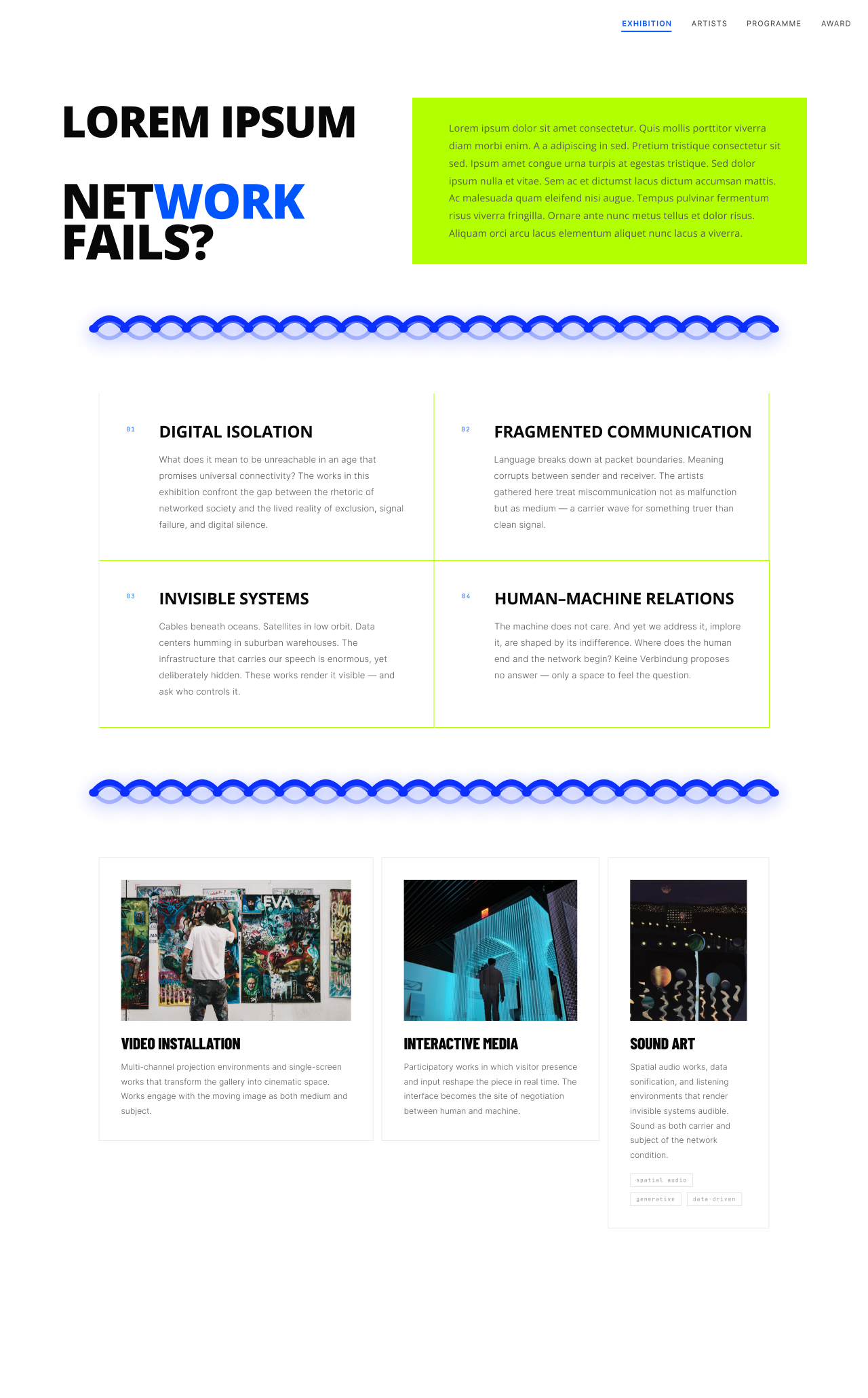
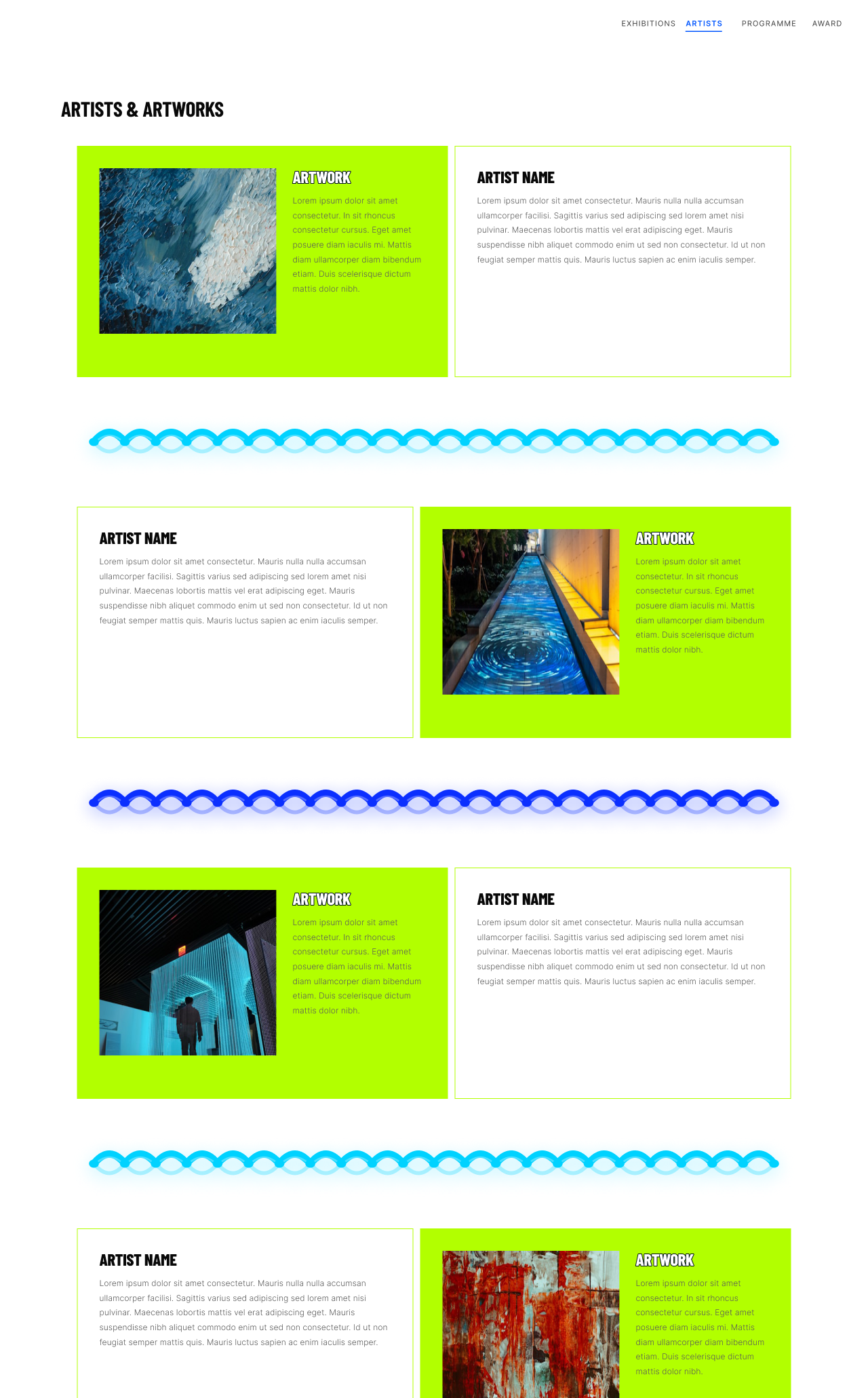
In the final designs I kept the strongest elements of the draft and gave them a system: black type on white, an electric blue for the cable dividers and a lime accent for the most important information, such as dates and calls to action.
Three things carried over from the draft: the heavy, oversized title type, the coiled cable and the lime accent. What changed was how they were used. In the draft the cable was a single loose line across the hero; in the final home page it also became a straight divider between sections. The lime grew from a small date tag into a full text panel, and the page gained structure the draft didn't have: four numbered themes and three category cards.
Home. The home page introduces the exhibition and its four themes, then leads visitors into the three categories of works: video installation, interactive media and sound art.
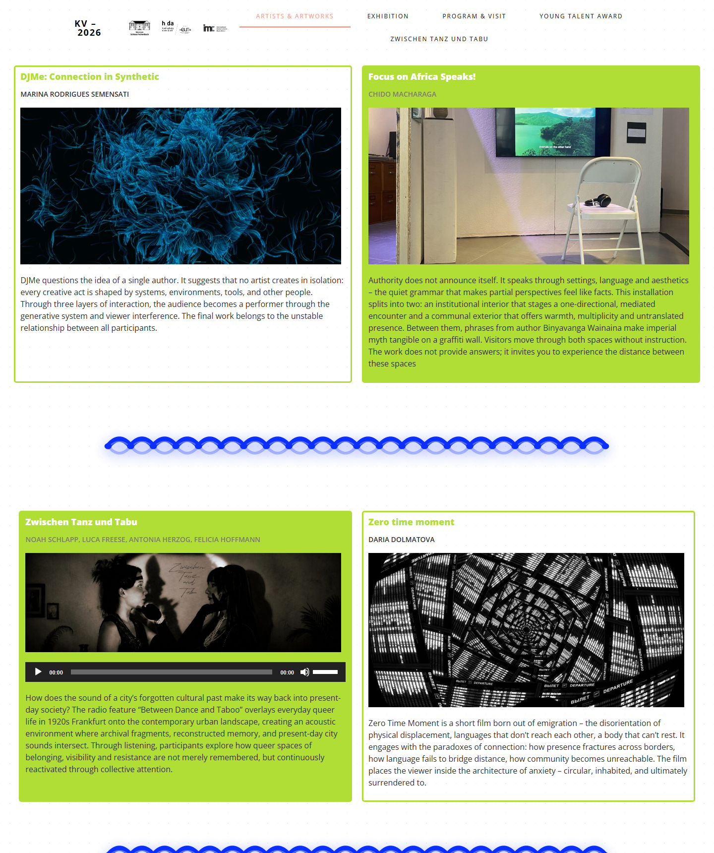
Artists & Artworks. Each work gets its own card with title, artist, media and a short description. The cards work for very different kinds of art: an image for visual pieces, an audio player for sound works.
From Figma to WordPress
I built both pages myself in WordPress with Elementor, translating the Figma layouts into responsive sections and reusable card layouts that the team could fill with each artist's content.
The live pages stay close to the designs: the oversized title, the cable motif, the lime date tags and the two-column artwork cards with images and audio players.
Designed in Figma, live in WordPress
- A visual concept for the site based on the exhibition's theme
- Final designs for the home and Artists & Artworks pages
- Both pages built and live in WordPress with Elementor
- Artwork cards that work for image-based and sound-based works
What I learned
Building my own designs in Elementor showed me quickly which details are easy to implement and which need a different solution. It also showed how much one recognizable element can do: the coiled cable connected the pages to each other and to the exhibition's message.
Because several of us worked on the same website, consistent colors, type and card layouts weren't a nice-to-have. They were what kept the pages looking like one site.